 |
| Click Images To See Them Larger |
Hey folks! If you've purchased the most recent issue of The Amplifier, you've probably seen my latest illustration, "X is for X-ray." Above is a detail from the image. We wanted this one to emphasize how we are all human beings and should be treated as such. It was important to depict a scenario in which someone was being ignored or treated worse just because the person is homeless. It was also important to invite the reader to take a moment to look inside and see the value in themselves & others. What better way to look inside than to use an X-ray? ;)
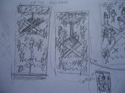
Here are a few of the thumbnail sketches I used to work out my approach to the concept and what composition would be best. These are very rough, but they only need to show my basic intentions for the illustration.
I became excited about the idea of using a "bird's eye" view and showing lots of people walking in a public place in Knoxville, TN, like Market Square.
Using the big "X" on the ground seemed to be the perfect way to add focus to the person others are overlooking.
I then gathered photo reference online and drew the people in pencil and inked over them.
Above, you see what the people looked like after I scanned them into the computer and made corrections in Photoshop. The same process was also used for the homeless teen you see added.
I also used this process to create parts of a planted tree that would appear in the illustration. I made it in pieces so that I could easily wiggle and shift its parts around in order to have the appropriate angle and foreshortening from the view above. I then colored the people, tree, and ground in Photoshop.
After researching back & chest X-rays, I was prepared to digitally "paint" them. Off to the side of my image, I made standard chest and back X-rays for men, women, and children. I then copy and pasted them over top of the people and adjusted and changed them to fit the person's body.
The final "definition" for X-ray was yet to be pinned down for this one, so I finished the image with the three options we had narrowed down. The first one was chosen to go to print.
I thought it might be cool to show you some of my process illustrating this one by making animated GIF of some of the steps. Here you can see how after the colors, I added the shadows, details, X-rays, and then the text last. I hope you enjoyed this little bit of "behind the scenes." Feel free to purchase the latest issue of The Amplifier up in the Knoxville area. God bless!


No comments:
Post a Comment