 |
| CLICK IMAGES TO ENLARGE |
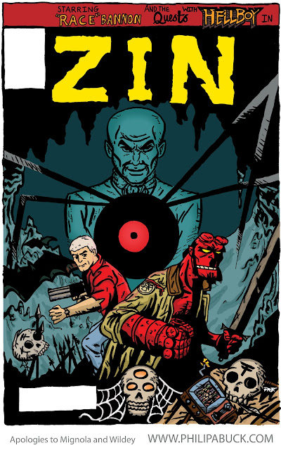
Oh man! I finished this a good little while back (a few months?) and having other stuff to post first, completely forgot to post this. I decided to do a little some more comic book covers to practice and if any were awesome I could use them for my portfolio or something. They wouldn't be for an actual comic, just for fun/practice. I thought about how cool it would be if the gang from Jonny Quest teamed up with Mignola's Hellboy and the B.P.R.D. Very cool. So I made a comic cover for a miniseries mash-up that would be called something like, "The Fall of Zin." Zin was the only reoccurring Quest villain as far as I know and he fits nicely into Hellboy's world too.
I did a bunch of sketches, as you can see. I was trying to figure out a good composition that would showcase the awesome qualities and moods of both Jonny Quest and Hellboy.
I looked up lots of covers and art by Mike Mignola and the other Hellboy and B.P.R.D. artists for reference and inspiration. I ate up Doug Wildey's amazing concept and character art of Race Bannon (of Quest fame,) for inspiration as well.
I finally pinned down which composition to use (a pretty straight forward 'classic hero pose' cover.) Then, drew the bad boy out on bristol board paper and went to inking it with my Faber-Castell PITT artist pens. I may have used my Pentel Color brush for the areas with lots of black.
I then scanned it up and adjusted in the ol' Photoshop. The 'before adjustments version' or 'raw' version is this one:
I decided I would use a different method of digital coloring this time around. I usually use the 'Chiarello Method' for work I'm spending this much time and effort on, but decided to use the 'Dharbin' way instead. I seems to be a mixture of the way I quickly color things for online use and the 'Chiarello Method' of coloring for print. I found it to be another good way to color work and I'm still deliberating on whether or not I'll use some version of it as my 'standard method.'Part of the 'Dharbin Way' of coloring is using a "color plan" to lay out what colors you want and where. It is often helpful to think of color shapes and palettes during this stage. After doing my color plan, I was glad I had because I realized I didn't quite like my choices. I decided to give it another go.
Here it is! Finished! The jury is still out on the colors- I'm always learning and I think the more I learn about color, the more I need to learn! I'm pretty happy with it for now though. :) Which colors do you like best? Anyways, I think it turned out better than my first go at a Jonny Quest cover I did a few months before:
Well, that's all for today. Thanks for stopping by! Remember that the article about my "Alternative Alphabet" illustrations is in this month's Amplifier. If you are in the Knoxville, TN area be sure to grab a copy before they are gone.
Also, don't forget that more of my work, daily musings, and things I dig can be found on my Tumblr and Twitter.
Until next post, God bless!


